MVVM: Binding RadioButton groups
A question I got recently was how to manage Radio Buttons with bindings – in this instance, the sample code was trying to map a single value to a set of Radio Buttons based on an enumeration set. The original implementation was using a Value Converter to compare the “bound” value with the enumeration value expected for that radio button choice – if it was equal then the converter returned true, otherwise false. Something like this:
<RadioButton Content="Blue"
     IsChecked="{Binding SelectedValue,
     Converter={StaticResource CheckValueAgainst}, ConverterParameter=Blue"/>

<RadioButton Content="Red"
     IsChecked="{Binding SelectedValue,
     Converter={StaticResource CheckValueAgainst}, ConverterParameter=Red"/>

<RadioButton Content="Yellow"
     IsChecked="{Binding SelectedValue,
     Converter={StaticResource CheckValueAgainst}, ConverterParameter=Yellow"/>
Initially this seemed to work, but as you changed the current enumeration value, the radio buttons would “lose” the binding – and after a few times you would end up with none of them selected.
Ultimately, this problem is really an expected behavior from WPF – when a set of Radio Buttons are placed together, they act as a group – where only one is expected to be checked and all the others are unchecked. This happens because the selected Radio Button itself tells the group to uncheck all the others. This has the effect of replacing the binding value for IsChecked with a local value of false. See the problem? Eventually, all of the buttons in the group have their value replaced and so we end up with all of them unchecked. The solution was very easy – put each one into a separate group by defining a unique GroupName for each Radio Button.
<RadioButton **GroupName="gBlue"** Content="Blue"
     IsChecked="{Binding SelectedValue,
     Converter={StaticResource CheckValueAgainst}, ConverterParameter=Blue"/>

<RadioButton **GroupName="gRed"** Content="Red"
     IsChecked="{Binding SelectedValue,
     Converter={StaticResource CheckValueAgainst}, ConverterParameter=Red"/>

<RadioButton **GroupName="gYellow"** Content="Yellow"
     IsChecked="{Binding SelectedValue,
     Converter={StaticResource CheckValueAgainst}, ConverterParameter=Yellow"/>
This solves the problem and required no real code changes, but of course, I didn’t want to stop there – I just had to whip up a quick MVVM version to show how I’d do this if I were responsible for the application!
Sample Application Description
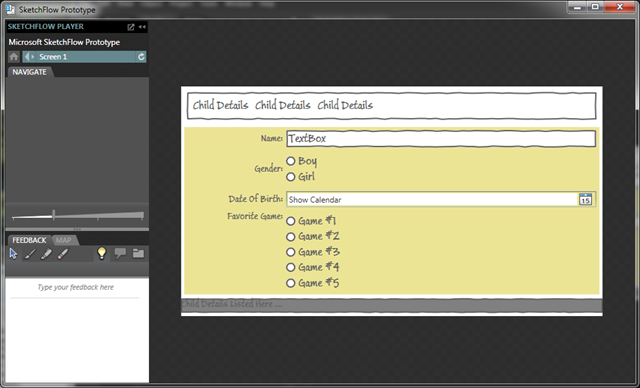
Our goal will be to display a list of children and their details to track their favorite games. I started by sketching it out with SketchFlow to get a sense of what I wanted to visually create:

The top list is a ListBox, showing each child and the bottom pane shows the details. Note the RadioButtons used to represent Gender and Favorite Game. Our goal will be to use a ListBox there as well – showing the list of Radio Buttons and bound to a ViewModel collection of data. As a secondary goal, we want to separate the RadioButton value from the text displayed.
It turns out that anytime you need to display a list or sequence of something, a ListBox (or ItemsControl if you don’t need the selection capability) is almost always a good choice. Let’s see if we can make it work here with the MVVM pattern.
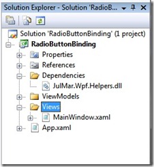
Now that I have an idea of what I want to build, I created a blank Windows WPF application and added the JulMar MVVM Helper library and created the directory structure I prefer (Views, ViewModels and Dependencies). I moved the Window1.xaml and corresponding code behind into the Views folder and renamed it MainWindow.xaml. This also required I adjust App.xaml to point to the correct StartupUri (ViewsMainWindow.xaml). As a quick start you could also just use the JulMar MVVM project template and delete the XAML and view models. Here’s what I ended up with in the solution:

Now, we’re ready to begin our data modeling. In this case, I don’t have a real data model – I’m not going to store or manage any of the children in a persistent way so I’m just going to define the View Model definitions for the children and collection. We’ll start with the child definition. I created a class to manage the properties of the child I want to display: Name, Dob, Gender, and FavoriteGame. For the Gender and Favorite Game, I will use Enums to model those as a known list. I could have used a Boolean for Gender as well, but this serves my underlying goal so we’ll go with an enumeration. Here’s what I came up with:
/// <summary>
/// Gender flag
/// </summary>
public enum Gender
{
    Male, Female, Unknown
}

/// <summary>
/// Game types
/// </summary>
public enum GameType
{
    Webkinz,
    Playdoh,
    PbsKids,
    Wii
}

/// <summary>
/// ViewModel to represent a single child.
/// </summary>
public class ChildViewModel : SimpleViewModel
{
    private string _name;
    private Gender _gender;
    private DateTime _dob;
    private GameType _favoriteGame;

    /// <summary>
    /// Name
    /// </summary>
    public string Name
    {
        get { return _name; }
        set { _name = value; OnPropertyChanged("Name","Details"); }
    }

    /// <summary>
    /// Gender of child
    /// </summary>
    public Gender Gender
    {
        get { return _gender; }
        set { _gender = value; OnPropertyChanged("Gender","Details"); }
    }

    /// <summary>
    /// Date of birth
    /// </summary>
    public DateTime Dob
    {
        get { return _dob; }
        set { _dob = value; OnPropertyChanged("Dob","Details"); }
    }

    /// <summary>
    /// Game they like to play
    /// </summary>
    public GameType FavoriteGame
    {
        get { return _favoriteGame; }
        set { _favoriteGame = value; OnPropertyChanged("FavoriteGame","Details"); }
    }

    /// <summary>
    /// Returns textual representation of child.
    /// </summary>
    /// <returns></returns>
    public string Details
    {
       get
       {
           return string.Format("{0} is a {1}, was born on {2:D} and loves to play {3}",
                        Name, Gender, Dob, FavoriteGame);
       }
    }
}
Pretty standard stuff – we have field backed properties and raise the PropertyChange notification on each one. For this case I don’t think we’ll need any additional services so I derive from the JulMar.Windows.Mvvm.SimpleViewModel class which just provides INotifyPropertyChanged support. The one extra thing I’ve added here is a Details property which is a concatenation of all the other properties – we’ll use this to verify that the data binding is working properly as a secondary display of the same data. We need to be sure to include that property invalidation when any of the other properties it depends on changes. The OnPropertyChanged implementation allows you to pass multiple strings for this very purpose.
Moving on, I want to display the generated Enumerations above as a list, so we need a way to encapsulate a value and the text used to represent the value together. If I were using .NET4 I could use the uber-cool new Tuple<K,V> class but I want to target .NET 3.5 here so we’ll define a new ValueAndText class to hold this:
/// <summary>
/// This class wraps a value and string together.
/// </summary>
/// <typeparam name="T">Type of value</typeparam>
public class ValueAndText<T>
{
    /// <summary>
    /// Value to bind to
    /// </summary>
    public T Value { get; private set; }

    /// <summary>
    /// Text string to present
    /// </summary>
    public string Text { get; private set; }

    /// <summary>
    /// Constructor
    /// </summary>
    /// <param name="value"></param>
    /// <param name="text"></param>
    public ValueAndText(T value, string text)
    {
        Value = value;
        Text = text;
    }
}
Now, let’s turn to the actual glue – the MainViewModel that pulls it all together.
/// <summary>
/// Main View Model that connects it all together.
/// </summary>
public class MainViewModel : SimpleViewModel
{
}
Let’s use a SimpleViewModel here as well. The first property we need is a collection for the children – we won’t be modifying the list (i.e. no adding or deleting) so the backing storage can just be a **List
/// <summary>
/// Collection of children
/// </summary>
public IList<ChildViewModel> Children { get; private set; }

/// <summary>
/// Constructor
/// </summary>
public MainViewModel()
{
    // Fill with sample data.
    Children = new List<ChildViewModel> {
      new ChildViewModel
      {
         Name = "Jonathan",
         Dob = new DateTime(2006, 3, 14),
         FavoriteGame = GameType.PbsKids,
         Gender = Gender.Male
      },
      ...
  };
}
Next, we want a single child to be the “current” selected child. This is just a property of type ChildViewModel exposed by the parent view model.
private ChildViewModel _currentChild;

/// <summary>
/// The current (and only for now) child
/// </summary>
public ChildViewModel CurrentChild
{
    get { return _currentChild; }
    set
    {
      if (_currentChild != value)
      {
         _currentChild = value;
         OnPropertyChanged("CurrentChild");
      }
   }
}
We’ll also set the first child as the current child in the MainViewModel constructor after we populate the collection:
// Set the first child as selected.
CurrentChild = Children[0];
We want to have a bindable list of the gender values (and text) and a bindable list of the game types. In this case, let’s take advantage of the ability to bind to any IEnumerable data source and just generate the list using the C# 2.0 iterator support:
/// <summary>
/// Gets the gender values
/// </summary>
public IEnumerable<ValueAndText<Gender>> GenderValues
{
    get
    {
        yield return new ValueAndText<Gender>(Gender.Male, "Boy");
        yield return new ValueAndText<Gender>(Gender.Female, "Girl");
        yield return new ValueAndText<Gender>(Gender.Unknown, "Unknown");
    }
}

/// <summary>
/// Gets the game types
/// </summary>
public IEnumerable<ValueAndText<GameType>> GameTypes
{
    get
    {
        yield return new ValueAndText<GameType>(GameType.Webkinz, "WebKinz (http://www.webkinz.com)");
        yield return new ValueAndText<GameType>(GameType.Playdoh, "Loves Playdoh");
        yield return new ValueAndText<GameType>(GameType.PbsKids, "PBS Kids (http://www.pbskids.com)");
        yield return new ValueAndText<GameType>(GameType.Wii, "Wii and other console");
    }
}
That should do it for our logic and data requirements, now let’s turn to the visualization for it. We have the following properties defined on the MainViewModel to drive the view:
| Property | Handles |
|---|---|
| Children | Collection of PersonViewModel objects with child details. |
| CurrentChild | Current (selected) child |
| GenderValues | Collection of ValueAndText objects to select child gender |
| GameTypes | Collection of ValueAndText objects to select the favorite game |
Using the SketchFlow prototype as an example, we’ll start with a DockPanel as the root element – locking a StatusBar at the bottom, a ListBox at the top and a Border (which will contain our details pane) as the fill content. We’ll use the JulMar ViewModelCreator markup extension to tie this to the MainViewModel, and let’s push the initial focus into the children ListBox using the FocusManager.FocusedElement attached property on the window.
<Window x:Class="RadioButtonBinding.Views.MainWindow"
   xmlns="http://schemas.microsoft.com/winfx/2006/xaml/presentation"
   xmlns:x="http://schemas.microsoft.com/winfx/2006/xaml"
   xmlns:julmar="http://127.0.0.1:8080/wpfhelpers"
   xmlns:ViewModels="clr-namespace:RadioButtonBinding.ViewModels"
   xmlns:Controls="clr-namespace:Microsoft.Windows.Controls;assembly=WPFToolkit"
   DataContext="{julmar:ViewModelCreator {x:Type ViewModels:MainViewModel}}"
   FocusManager.FocusedElement="{Binding ElementName=lbChildren}"
   Title="Game Preference Tracker" Height="400" Width="500" Background="OldLace">
 <DockPanel>
     <!-- List of children we are tracking -->
     <ListBox x:Name="lbChildren" DockPanel.Dock="Top">
     </ListBox>

     <!-- StatusBar just to make sure two-way binding is working properly -->
     <StatusBar DockPanel.Dock="Bottom" BorderBrush="Black" BorderThickness="0,1,0,0">
     </StatusBar>

     <!-- Details pane -->
     <Border Margin="5" BorderBrush="LightGray" BorderThickness="1">
     </Border>
 </DockPanel>
</Window>
Next, let’s fill in the top ListBox details. We need to populate it with the list of children – this is the Children property off our ViewModel, so we’ll bind the ItemsSource property to that collection. Next, we’ll set the SelectedItem to the CurrentChild property – making sure to use a two-way binding:
<ListBox x:Name="lbChildren" DockPanel.Dock="Top" ItemsSource="{Binding Children}"
                SelectedItem="{Binding CurrentChild, Mode=TwoWay}" />
This will generate a list of items, but won’t have any decent visualization – so we’ll use a DataTemplate to give us a basic visual, at the same time, let’s replace the default panel with a WrapPanel so it looks more like our SketchFlow:
<ListBox x:Name="lbChildren" DockPanel.Dock="Top" ItemsSource="{Binding Children}"
        SelectedItem="{Binding CurrentChild, Mode=TwoWay}"
        ScrollViewer.HorizontalScrollBarVisibility="Disabled">
 <ListBox.ItemsPanel>
     <ItemsPanelTemplate>
         <WrapPanel />
     </ItemsPanelTemplate>
 </ListBox.ItemsPanel>

 <ListBox.ItemTemplate>
     <DataTemplate>
         <Border BorderBrush="DarkBlue" BorderThickness="2"
             Background="SkyBlue" CornerRadius="5">
             <StackPanel Margin="10">
                 <TextBlock FontWeight="Bold" FontSize="12pt" Text="{Binding Name}" />
                 <TextBlock Text="{Binding FavoriteGame}" />
             </StackPanel>
         </Border>
     </DataTemplate>
 </ListBox.ItemTemplate>
</ListBox>
Now, let’s turn our attention to displaying the current child details. Remember the properties we created on the ChildViewModel:
| Property | Defines |
|---|---|
| Name | Their name |
| Gender | Their gender – Male/Female/Unknown |
| Dob | The date of birth |
| Details | The string with all the details for this child. |
So let’s first use the details – we can bind a TextBlock in the StatusBar to the CurrentChild.Details property to display the selected child details:
<!-- StatusBar just to make sure two-way binding is working properly -->
<StatusBar DockPanel.Dock="Bottom" BorderBrush="Black" BorderThickness="0,1,0,0">
 <TextBlock Text="{Binding CurrentChild.Details}" TextWrapping="Wrap" />
</StatusBar>
Now, let’s turn our attention to the details – we’ll use a Grid to lay it out within the Border, the Name and Date Of Birth are pretty easy to just drop in a set of Labels and TextBox/DatePicker – we’ll need the WPF Toolkit for this. We’ll drop in two ListBox elements for the Radio Button list.
<Border Margin="5" BorderBrush="LightGray" BorderThickness="1">
  <Grid>
    <Grid.Resources>
      <!-- Common style for header labels -->
      <Style TargetType="Label">
        <Setter Property="HorizontalAlignment" Value="Right"/>
        <Setter Property="VerticalAlignment" Value="Top"/>
        <Setter Property="FontWeight" Value="Bold"/>
        <Setter Property="Margin" Value="5,2"/>
      </Style>
    </Grid.Resources>
    <Grid.ColumnDefinitions>
      <ColumnDefinition Width="Auto"/>
      <ColumnDefinition/>
    </Grid.ColumnDefinitions>
    <Grid.RowDefinitions>
      <RowDefinition Height="Auto"/>
      <RowDefinition Height="Auto"/>
      <RowDefinition Height="Auto"/>
      <RowDefinition Height="Auto"/>
    </Grid.RowDefinitions>
    <Label Grid.Row="0" Content="Name:"/>
    <TextBox Grid.Row="0" Grid.Column="1" Margin="5,2" Text="{Binding CurrentChild.Name}"/>
    <Label Grid.Row="1" Content="Gender:"/>
    <ListBox Grid.Row="1" Grid.Column="1"/>
    <Label Grid.Row="2" Content="Date Of Birth:"/>
    <Controls:DatePicker Grid.Row="2" Grid.Column="1" Margin="5,2" SelectedDate="{Binding CurrentChild.Dob}"/>
    <Label Grid.Row="3" Content="Favorite Game:"/>
    <ListBox Grid.Row="3" Grid.Column="1"/>
  </Grid>
</Border>```

Let’s focus on the Gender list first – the same concepts will apply to the game list.  We have an **IEnumerable** list of **ValueAndText** objects – each object has a Value property (corresponding to the underlying **enum** value tracked in the **ChildViewModel**) and a Text property which is what we want displayed in the **RadioButton** choice.  First, let’s set it up so we get a list of **RadioButtons** – we can do this by changing the **ControlTemplate** for each item in the list itself – that is, change the **ListBoxItem** control template.

As a bit of background, anytime you add an element to an **ItemsControl** (**ListBox**, **ComboBox**, **TreeView**, **Menu**, etc.) a special wrapper is internally created around your data to provide the special UI properties necessary to drive the functionality – things like focus, selection, mouse-over, etc. are all provided by this wrapper.  In the case of the **ListBox**, the created wrapper is a **ListBoxItem** class and we can control it’s properties by overriding the **ItemContainerStyle** on the **ListBox** itself.  So, to start off, we’ll create a new **Style** for the **ListBox**, set some basic properties and then override the **ListBoxItem** style inside that:

```xml
<Style x:Key="radioListBox" TargetType="ListBox" BasedOn="{StaticResource {x:Type ListBox}}">
  <Setter Property="BorderThickness" Value="0"/>
  <Setter Property="Margin" Value="5"/>
  <Setter Property="Background" Value="{x:Null}"/>
  <Setter Property="ItemContainerStyle">
    <Setter.Value>
      <Style TargetType="ListBoxItem" BasedOn="{StaticResource {x:Type ListBoxItem}}">

 </Style>
    </Setter.Value>
  </Setter>
</Style>
Since this is going to list a group of radio buttons, we’ll drop the border off the ListBox and the Background color as well so that our parent’s background shows through. We’ll throw a Margin on there to give it a little spacing. Next, to change the visualization of the ListBoxItem, we’ll override it’s ControlTemplate (the thing that generates the visual tree for the item). This, like all Controls in WPF, is done by overriding the Template property. What we want is put a Radio Button in there:
<Style TargetType="ListBoxItem" BasedOn="{StaticResource {x:Type ListBoxItem}}">
  <Setter Property="Template">
    <Setter.Value>
      <ControlTemplate TargetType="ListBoxItem">
        <RadioButton IsChecked="{TemplateBinding IsSelected}">
          <ContentPresenter/>
        </RadioButton>
      </ControlTemplate>
    </Setter.Value>
  </Setter>
</Style>
In order to get the IsChecked state properly setup, we’ll bind it to the ListBoxItem.IsSelected property – so if the item is selected according to the ListBox, then the Radio Button will be checked. We also drop a ContentPresenter into the RadioButton so it displays whatever the data bound value is – this will provide for any DataTemplate visualization if one is present. This will achieve the visualization we desire, but it won’t work properly as we interact with it. The problem is that the Radio button will override this state when it is clicked – exactly the problem we had originally!
To fix this, let’s make the radio button invisible to the mouse and keyboard.. we can do this by setting the Focusable and IsHitTestable properties to false – however this makes them non-interactive and now we can’t select the ListBoxItem with the mouse.. so, let’s wrap it in something that is selectable – anything should work, so we’ll just throw it into a Grid. Set the Grid.Background to transparent so you can click on it and we end up with:
<Style TargetType="ListBoxItem" BasedOn="{StaticResource {x:Type ListBoxItem}}">
  <Setter Property="Template">
    <Setter.Value>
      <ControlTemplate TargetType="ListBoxItem">
        <Grid Background="Transparent">
          <RadioButton Focusable="False" IsHitTestVisible="False" IsChecked="{TemplateBinding IsSelected}">
            <ContentPresenter/>
          </RadioButton>
        </Grid>
      </ControlTemplate>
    </Setter.Value>
  </Setter>
</Style>
This does exactly what we want – clicking on the radio button changes the selection in the ListBox and, in turn, checks or unchecks the radio button in question. Now, let’s wire it up to our data – remember we have a Value and Text. We want to bind to the Value but display the Text. It turns out the ListBox already has this feature backed in – there is a SelectedItem property we normally use, but there is also a SelectedValue property that makes the distinction between the item in the collection and the value used to select it. There is also a DisplayMemberPath and SelectedValuePath property used for data binding purposes when generating the content from an ItemsSource supplied value. Pulling these things together we can do this:
<ListBox Grid.Row="1" Grid.Column="1"
    Style="{StaticResource radioListBox}"
    DisplayMemberPath="Text"
    SelectedValuePath="Value"
    ItemsSource="{Binding GenderValues}"
    SelectedValue="{Binding CurrentChild.Gender}" />
Testing this, it works perfectly! Since the DisplayMemberPath/SelectedValuePath are the same for the two lists, we can move that to our radioListBox style, leaving us with the two ListBox definitions being:
<ListBox Grid.Row="1" Grid.Column="1" Style="{StaticResource radioListBox}"
    ItemsSource="{Binding GenderValues}"
    SelectedValue="{Binding CurrentChild.Gender}" />
...

<ListBox Grid.Row="3" Grid.Column="1" Style="{StaticResource radioListBox}"
    ItemsSource="{Binding GameTypes}"
    SelectedValue="{Binding CurrentChild.FavoriteGame}" />
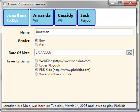
And the completed application looks like:

You can download the completed project here: RadioButtonBinding Test