MVVM: IUIVisualizer and event management with behaviors
In this post, we will look at the IUIVisualizer, and bring together some of the concepts we’ve talked about already through a new sample – a simple picture viewer:
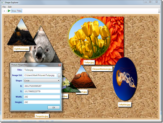
The application grabs all the images from the user’s photo folder and then displays each one onto the surface of a corkboard. You can change the properties of an image, remove an image or add additional images. It’s not designed to be a true image application ala photoSuru, it’s really more of a sample of MVVM practices with the helper library. Here’s some of the coding examples present in the sample:
- It registers a
ISelectFileservice and implements it as an OpenFileDialog. - It displays a “Picture Properties” dialog using the
IUIVisualizerservice. - It maps mouse DoubleClick on an image into a command in the ViewModel to display the properties.
- It provides drag support through a behavior on the style.
Let’s look at this four features in particular. Download the sample from here:
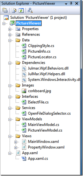
Open the project in Visual Studio, it should build and run without any issues. The project structure is pretty much like all the other samples I’ve blogged about – I’m trying to keep to a consistent model:
Service Registration
If you look at the App.xaml.cs code behind, you’ll find the registration work being done in the constructor:
public App()
{
    // Register the typical services (UI, Error, etc.) for this application.
    ViewModel.RegisterKnownServiceTypes();

    // Register the file selector service.
    ViewModel.ServiceProvider.Add(typeof(ISelectFile), new OpenFileDialogSelector());

    // Register the UI dialogs.
    var uiVisualizer = ViewModel.ServiceProvider.Resolve<IUIVisualizer>();
        uiVisualizer.Register("ShowElementProperties", typeof(PropertyWindow));
}
First, note that it registers the standard services – that’s something I always do, even if I don’t anticipate needing them all, it doesn’t hurt to have them there. Next, it adds the file selector service by calling ServiceProvider.Add on the ViewModel class. The interface is defined as a single method:
namespace PictureViewer.Interfaces
{
    public interface ISelectFile
    {
        string SelectFile(string fileFilters);
    }
}
The registration ties this interface to an implementation that displays the OpenFileDialog, for testing purposes, that would be replaced with a minimum of two implementations: one that returns null/empty and one that returns a valid filename to test both cases.
The final line in the app.xaml.cs file registers a UI dialog to display the properties of the image. This is done through the IUIVisualizer interface which is defined in the helper library:
namespace JulMar.Windows.Interfaces
{
    public interface IUIVisualizer
    {
        void Register(string key, Type winType);
        bool Unregister(string key);
        bool Show(string key, object state, bool setOwner, EventHandler<UICompletedEventArgs> completedProc);
        bool? ShowDialog(string key, object state);
    }
}
Notice the Register and Unregister methods take a string defined as a “key”. This is the key that invokers will use to display the UI visually; I often use the typename of the View, but you can use any string here as long as you are consistent in registration vs. invocation. In this sample, I’ve used the key “ShowElementProperties” – we’ll see in a moment how it is displayed. The second parameter for the Register method takes the Type to display. The type must be a WPF Window-derived type (i.e. NavigationWindow or Window) and will represent the View in our MVVM pattern.
Displaying a UI with IUIVisualizer
In the PictureViewModel type, there is an ICommand that is used to drive the Property window:
/// <summary>
/// Command to show the image properties.
/// </summary>
public ICommand ShowPropertiesCommand { get; private set; }
The default constructor fills that in with a DelegatingCommand to jump to a method of the ViewModel:
public PictureViewModel()
{
    _picture = new PictureInfo();
    ShowPropertiesCommand = new DelegatingCommand(ShowProperties);
    SelectNewImageFile = new DelegatingCommand(OnSelectNewFile);
    RemovePicture = new DelegatingCommand(
                  () => SendMessage(MainViewModel.RemovePictureMessage, this));
}

/// <summary>
/// Display the UI associated with this picture
/// </summary>
internal void ShowProperties()
{
    var uiVisualizer = Resolve<IUIVisualizer>();
    if (uiVisualizer != null)
    {
        uiVisualizer.ShowDialog("ShowElementProperties", this);
    }
}
The handler method is marked as internal because the MainViewModel forwards it’s own command to this same method handler (from the menu and toolbar). Notice that the method first gets the IUIVisualizer service; you must use the same service instance where you registered the UI view. Next, it calls ShowDialog to display a modal view. It takes two parameters – the view key, and the view model.
A modal view is one that forces the user to interact and dismiss the dialog before they can continue working with the other elements in the application. It is what, as an example, applications often use for Options dialogs. ShowDialog will display the View associated with the given string key (“ShowElementProperties”). The second parameter is the ViewModel you want to associate to it – in this case we are passing the associated picture we want to work with. The dialog is then displayed and allows the user to edit the picture properties:
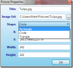
The XAML code for this view is contained in the PropertyWindow.xaml file – it has a couple of interesting elements to it which you will see when you interact with this dialog:
-
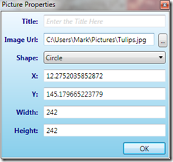
Watermarked Text display: if you remove the title, it will display some grayed out text in it’s place “Enter the Title Here”:
-
Numeric TextBox: if you move your mouse cursor over the X/Y/Width/Height boxes you will see a sizing arrow that allows you to drag and change the values without typing. You can also double-click to change the values and it enforces numeric text box behavior.
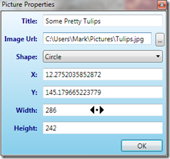
Both of these are accomplished with Blend Behaviors. There are plenty of resources on the web about these so I won’t go into detail on their creation – check the library source code if you want to see how they work, but using them involves taking a dependency on two assemblies:
- System.Windows.Interactivity.dll
- JulMar.Wpf.Behaviors.dll
Both of these are included in the Dependencies folder. The first comes from the Blend SDK and is freely redistributable with your project. To use them, you add the behavior to the visual element in question, for example, the watermarked textbox behavior gets applied like this:
<TextBox Text="{Binding Title}">
  <Interactivity:Interaction.Behaviors>
    <julmar:WatermarkTextBoxBehavior Text="Enter the Title Here"/>
  </Interactivity:Interaction.Behaviors>
  <TextBox.Style>
    <Style TargetType="TextBox" BasedOn="{StaticResource {x:Type TextBox}}">
      <Setter Property="FontStyle" Value="Normal"/>
      <Style.Triggers>
        <Trigger Property="julmar:WatermarkTextBoxBehavior.IsWatermarked" Value="True">
          <Setter Property="FontStyle" Value="Italic"/>
          <Setter Property="Foreground" Value="LightGray"/>
        </Trigger>
      </Style.Triggers>
    </Style>
  </TextBox.Style>
</TextBox>
I’ve also applied a Trigger to change the font/colors when the TextBox is watermarked.
The numeric behavior looks like this:
<TextBox Grid.Row="5" Text="{Binding Width, UpdateSourceTrigger=PropertyChanged}">
    <Interactivity:Interaction.Behaviors>
        <julmar:NumericTextBoxBehavior AllowMouseDrag="True" />
    </Interactivity:Interaction.Behaviors>
</TextBox>
Notice that I’ve changed the Binding.UpdateSourceTrigger to be PropertyChanged – this is so the dragging effect works properly and updates the value in the underlying view model.
Ways to invoke commands in the view
So let’s look now at how we get the command executed. Switching to the MainWindow.xaml you will find three places where the Show Properties command is wired up.
First, it can be invoked using a keyboard accelerator. This requires using a BindableCommand from the library, placing it into resources and then binding against that. The command we will be executing is the one on the MainViewModel so it requires the actual picture element as a parameter:
<Window.Resources>
    <julmar:BindableCommand x:Key="propsCommand" Command="{Binding ShowPropertiesCommand}" CommandParameter="{Binding SelectedPicture}" />
</Window.Resources>
<Window.InputBindings>
    <KeyBinding Key="r" Modifiers="Ctrl+Alt" Command="{StaticResource propsCommand}" />
</Window.InputBindings>
The MainViewModel simply forwards this command onto the PictureViewModel using a typed DelegatingCommand:
ShowPropertiesCommand = new DelegatingCommand<PictureViewModel>(p => p.ShowProperties(), p => p != null);
Next, we can invoke the command using the menu and toolbar:
<MenuItem Header="_Edit">
  <MenuItem Header="Add _New Picture" Command="{Binding AddNewCommand}"/>
  <MenuItem Header="_Remove Picture" Command="{Binding RemoveCommand}" CommandParameter="{Binding SelectedPicture}"/>
  <Separator/>
  <MenuItem Header="P_roperties" Command="{Binding ShowPropertiesCommand}" CommandParameter="{Binding SelectedPicture}"/>
</MenuItem>
   ...

<ToolBar DockPanel.Dock="Top">
  <Button ToolTip="Add New Picture" Command="{Binding AddNewCommand}" Content="+" FontWeight="Bold"/>
  <Button ToolTip="Remove Picture" Command="{Binding RemoveCommand}" CommandParameter="{Binding SelectedPicture}" Content="-" FontWeight="Bold"/>
  <Button ToolTip="Properties" Command="{Binding ShowPropertiesCommand}" CommandParameter="{Binding SelectedPicture}"/>
   ...
</ToolBar>
Note that here we are also binding to the MainViewModel command – so we must supply the parameter using the CommandParameter. The final invocation place is when you double-click on the picture itself. This is done a little differently if you’ve not done much WPF work.
A quick segway – View code behind vs. View Models
First, the display of images is actually housed in a ListBox. It turns out that anytime you need to display multiple things grouped somehow, and allow the user to select one or more of those things, a ListBox is almost always the way to go. WPF allows us to customize the visuals however we like, so here the panel has been replaced with a Canvas (allowing pixel positioning), and each item is drawn as a DataTemplate. The template decides how to render each item in the ListBox – the PictureViewModel in this case. In the sample, it is rendering an image and an optional TextBlock that is turned on and off through a property (and can be changed through the tool bar). I encourage you to look at the code to see how all that is done.
One of the core things necessary in MVVM is the ability to interact with visuals and then sometimes push notifications of that interaction back to the view model. I say “sometimes” because it’s perfectly acceptable to place code into the code behind for the XAML as well. Where you put the logic depends on whether it is view-specific and whether you want to test it independently of the view. If it’s not view specific OR you want to test it, then move it into the view model. An example of something that we probably don’t care about is closing the application – I’ve wired it up to a command here just to show that you can, but it’s completely unnecessary to do that. The view model isn’t doing any closing logic, so it would be fine to wire a handler into the MainWindow.xaml.cs and just call “this.Close()” in there.
Ok, so back to the double-click implementation. In the DataTemplate assigned to the ListBox.ItemTemplate property you will find the definition for the image itself:
<Image x:Name="imageHolder" Width="{Binding Width}" Height="{Binding Height}"
      Source="{Binding Image}" Stretch="Fill"
       HorizontalAlignment="Center" VerticalAlignment="Center">

    <Interactivity:Interaction.Triggers>
        <julmar:DoubleClickTrigger>
        <julmar:InvokeCommand Command="{Binding ShowPropertiesCommand}" />
        </julmar:DoubleClickTrigger>
        </Interactivity:Interaction.Triggers>
    </Image>
Note the use of the Interaction.Triggers tag – this is also part of the Blend behavior implementation. In this case, we are triggering off something (property change, event, etc.) and then performance some action. In the JulMar.Wpf.Behaviors assembly you will find a whole bunch of triggers, behaviors and actions. In this case, I am using the DoubleClickTrigger which monitors for a quick double tap of the left mouse button. When that happens, it runs the list of actions associated with it – in this case, it invokes the ShowPropertiesCommand. Now, here we are defining the trigger behavior on the UI that is bound to an actual PictureViewModel (note the property bindings on the image and you will see that I’m telling you the truth!) So here the command being invoked is the PictureViewModel command – so no parameter is necessary.
Drag/Position Behavior
The last thing I want to point out is the dragging behavior. This is also done through a Blend behavior, but it is being applied in a slightly different way: through a Style.
<ListBox.ItemContainerStyle>
    <Style TargetType="ListBoxItem">
        <Setter Property="julmar:DragPositionBehavior.IsEnabled" Value="True" />
        <Setter Property="Canvas.Left" Value="{Binding X, Mode=TwoWay}" />
        <Setter Property="Canvas.Top" Value="{Binding Y, Mode=TwoWay}" />
        <Setter Property="IsSelected" Value="{Binding IsSelected, Mode=TwoWay}" />
        ...
Now, for those who have used Blend behaviors a lot, you may now that it is currently not possible to apply behaviors through Styles. This is a restriction of the Attached Property definition being used – the collection cannot be associated on a style. This is a very unfortunate problem because it makes my scenario very hard: I want to drag and reposition these items around through the mouse. If I put the behavior onto the DataTemplate then I move the content but not the item container itself (the thing that provides selection and focus rendering) So I would end up with a very weird visualization where you click on an item and the focus rectangle is drawn in a completely different place than the item itself!
So, in my set of behaviors, many of them allow you to setup the behavior both through Blend and through Style setters (or directly on an element without the full Blend syntax). I do this by adding an attached property onto the behavior class and then injecting my behavior into the element where the attached property is set. I’ll show this in a future blog post to give an example for those who’d like to do the same for their own behaviors.
Another question I’ve fielded is why did I even create this behavior at all when the Blend sample already exists to do this? Well, the short answer is because I had a specific goal in mind here – this behavior knows about Canvas panels. If the behavior is attached to an element in a Canvas, it changes the position by changing the Canvas.Left and Canvas.Top properties. If not, it uses a RenderTransform. The supplied blend sample only uses RenderTransform (at least when I last looked at it).