Variable sized tiles in Windows Store Apps
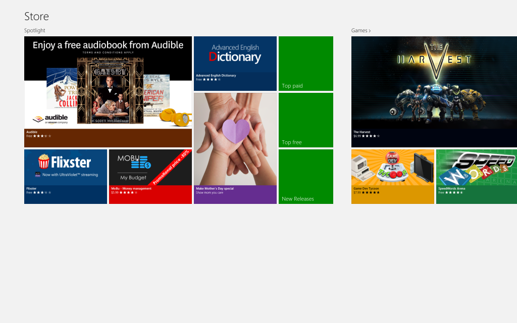
One of the common requests I hear when training customers on Windows 8 is “How do I create variable sized tiles in a GridView?” The Windows Store app utilize this technique where different tiles have different sizes to promote content.

It turns out this is relatively easy in HTML - which is probably one of the reasons Microsoft chose to use that visual platform to build the app. In XAML however, this is a bit more difficult. There are many posts which detail using a VariableSizeWrapGrid with a GridView to achieve a similar effect - I like Mike Taulty’s blog on the approach. And this does work as long as you don’t want to have different sized rows and columns, and you don’t have too many items. The problem is that the VariableSizeWrapGrid doesn’t support virtualization or incremental loading - both key technologies if you have a lot of items.
An alternative approach to this is to do the layout yourself and use a Canvas as the panel - in this sense, you (the programmer) have to manage the layout and it’s not done automatically as rows and columns, but the upside is you have complete control over the layout and performance is greatly improved.
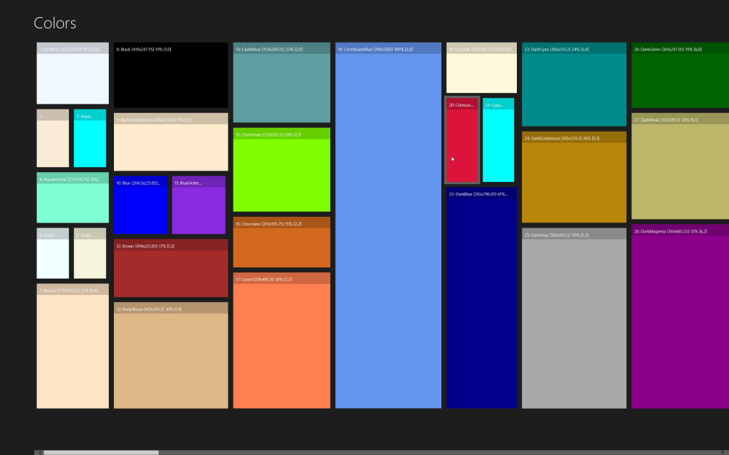
For a test, I chose to enumerate the available colors and then randomly create rows and columns - here’s a single run:

Notice that in this case the sample has two items side-by-side in the same column, and also has different sized columns and items that span rows - in fact, because I’m using a Canvas as my panel, I can use any sized element I choose - I’m not required to enforce columns and rows at all like I am with the grid-based panels.
The code is relatively straight-forward - I’m using MVVM so I put the Top/Width/Height into properties on the ColorViewModel:
public sealed class ColorViewModel : SimpleViewModel
{
    #region Data

    private int _heightPercent;
    private double _height, _width;
    private double _top, _left;

    #endregion

    /// <summary>
    /// Color for this item
    /// </summary>
    public string Color { get; set; }

    /// <summary>
    /// Index of the item (used for label)
    /// </summary>
    public int Index { get; set; }

    /// <summary>
    /// Row for the item (used for label)
    /// </summary>
    public int Row { get; set; }

    /// <summary>
    /// Column for the item (used for label)
    /// </summary>
    public int Col { get; set; }

    /// <summary>
    /// Left position relative to (0,0).
    /// </summary>
    public double Left
    {
        get { return _left; }
        set { SetPropertyValue(ref _left, value); }
    }

    /// <summary>
    /// Top position - changes when the Height of the GridView
    /// is altered (i.e. screen orientation)
    /// </summary>
    public double Top
    {
        get { return _top; }
        set { SetPropertyValue(ref _top, value); }
    }

    /// <summary>
    /// Width of this item
    /// </summary>
    public double Width
    {
        get { return _width; }
        set { SetPropertyValue(ref _width, value); }
    }

    /// <summary>
    /// Height to use for this item - calculated by the MainViewModel
    /// once it knows the actual height of the GridView using the Height %
    /// </summary>
    public double Height
    {
        get { return _height; }
        set { SetPropertyValue(ref _height, value); }
    }

    /// <summary>
    /// How much of the height to take up as a %
    /// </summary>
    public int HeightPercent
    {
        get { return _heightPercent; }
        set { SetPropertyValue(ref _heightPercent, value); }
    }

    /// <summary>
    /// This indicates if the cell is shared with another item in the
    /// same column/row (side-by-side)
    /// </summary>
    public bool IsSplitCell { get; set; }

    /// <summary>
    /// Returns a string that represents the current object.
    /// </summary>
    public override string ToString()
    {
        return string.Format("{0}: {1} ({2}x{3}) {4}% [{5},{6}]", Index, Color, Width, Height, HeightPercent, Col, Row);
    }
}
These properties are then calculated by the MainViewModel for each of the known colors - the position is randomly determined here just for example purposes, presumably in a real application (such as the Windows Store app) there would be an XML data file pulled from a server to display the data - but in any case there would be an known row/column and size for each element. Note there is a little code at the end of each loop iteration to ensure we always end the height of the column at 100%. The two important bits of code here are the ViewHeight property and the constructor which loads the items.
public sealed class MainViewModel : SimpleViewModel
{
    #region Data

    private readonly Random _rng = new Random();
    private double _viewHeight = Double.NaN, _viewWidth;
    private readonly List<ColorViewModel> _backingStore;

    #endregion

    /// <summary>
    /// This is set to the actual height of the panel
    /// it then calculates the proper height and top of each item
    /// </summary>
    public double ViewHeight
    {
        get { return _viewHeight; }
        set
        {
            SetPropertyValue(ref _viewHeight, value);

            double top = 0;
            for (int index = 0; index < _backingStore.Count; index++)
            {
                var cvm = _backingStore[index];
                if (cvm.Row == 0) top = 0;

                cvm.Height = _viewHeight * (cvm.HeightPercent / 100.0) * .9;

                if (index > 0 && _backingStore[index - 1].IsSplitCell)
                {
                    cvm.Top = _backingStore[index - 1].Top;
                }
                else
                {
                    cvm.Top = top;
                    top += cvm.Height;
                }
            }
        }
    }

    /// <summary>
    /// The calculated width of the panel - this is required so we get scrollbars in the GridView.
    /// </summary>
    public double ViewWidth
    {
        get { return _viewWidth; }
        set { SetPropertyValue(ref _viewWidth, value); }
    }

    /// <summary>
    /// The list of colors
    /// </summary>
    public IList<ColorViewModel> Colors { get; private set; }

    /// <summary>
    /// Constructor
    /// </summary>
    public MainViewModel()
    {
        _backingStore = typeof(Colors).GetTypeInfo().DeclaredProperties.Select(p => new ColorViewModel {Color = p.Name})
            .ToList();

        int currentColumn = 0;
        double currentWidth = 0;

        // Calculate the position of each item.
        for (int i = 0; i < _backingStore.Count;)
        {
            int columnWidth = _rng.Next(200, 500);
            int numberOfColors = _rng.Next(1, 7);
            int trackPct = 0;

            // Create a single column
            for (int c = 0; c < numberOfColors && trackPct < 95 && i < _backingStore.Count; i++, c++)
            {
                ColorViewModel cvm = _backingStore[i];
                cvm.Index = i + 1;
                cvm.Col = currentColumn;
                cvm.Row = c;
                cvm.Left = currentWidth;

                // Decide the height of this item.
                int maxH = Math.Min(100 - trackPct, 100 / numberOfColors);
                int h = _rng.Next(15, maxH);

                // Allow it to share row with second item
                if (c > 0 && _backingStore[i - 1].IsSplitCell)
                {
                    var previousCell = _backingStore[i - 1];
                    cvm.Left = previousCell.Left + previousCell.Width;
                    cvm.Width = previousCell.Width;
                    cvm.HeightPercent = previousCell.HeightPercent;
                    c--;
                }
                else
                {
                    trackPct += h;
                    cvm.HeightPercent = h;

                    if (c > 0 && numberOfColors > 2 && _rng.Next(4) == 1) // 1/4 chance
                    {
                        cvm.Width = (columnWidth / 2.0) - 5;
                        cvm.IsSplitCell = true;
                    }
                    else cvm.Width = columnWidth;
                }
            }

            // Make sure we always end on 100%
            _backingStore[i - 1].HeightPercent += 100 - trackPct;
            _backingStore[i - 1].Width = columnWidth;
            _backingStore[i - 1].IsSplitCell = false;

            currentColumn++;
            currentWidth += columnWidth;
        }

        Colors = _backingStore;
        ViewWidth = currentWidth;
    }
}
The last piece of the puzzle is the XAML - in order to properly size the height, we need the actual height of the GridView itself, so the code behind hooks the SizeChanged event on the GridView and then passes the newly calculated size onto the MainViewModel:
private void OnPanelSizeChanged(object sender, Windows.UI.Xaml.SizeChangedEventArgs e)
{
    // Populate DC after first resize so we don't see small-ish items on first render.
    if (DataContext == null)
    {
        DataContext = new MainViewModel();
    }

    // Set the new actual height
    MainViewModel vm = (MainViewModel) DataContext;
    vm.ViewHeight = e.NewSize.Height;
}
We also need to respect the Canvas.Left and Canvas.Top properties - this would normally be done in an ItemContainerStyle, but unfortunately setting attached properties is not currently supported. To compensate for this, we override the GridView and set our properties onto each ItemContainer in the PrepareContainerForOverride method:
/// <summary>
/// This is here just to create a binding for the Height/Width on the GridViewItem.
/// WinRT currently doesn't support attached properties in Style setters.
/// </summary>
public class VariableSizedGridView : GridView
{
    protected override void PrepareContainerForItemOverride(DependencyObject element, object item)
    {
        BindingOperations.SetBinding(element, Canvas.LeftProperty, new Binding {Path = new PropertyPath("Left")});
        BindingOperations.SetBinding(element, Canvas.TopProperty, new Binding {Path = new PropertyPath("Top")});
        BindingOperations.SetBinding(element, WidthProperty, new Binding {Path = new PropertyPath("Width")});
        BindingOperations.SetBinding(element, HeightProperty, new Binding {Path = new PropertyPath("Height")});

        base.PrepareContainerForItemOverride(element, item);
    }
}
And, of course we replace the panel for the derived GridView with a Canvas:
<differentSizedTiles:VariableSizedGridView ItemsSource="{Binding Colors}" Grid.Column="1" Grid.Row="1">
  <GridView.ItemContainerStyle>
    <Style TargetType="GridViewItem">
      <Setter Property="HorizontalContentAlignment" Value="Stretch"/>
      <Setter Property="VerticalContentAlignment" Value="Stretch"/>
    </Style>
  </GridView.ItemContainerStyle>
  <GridView.ItemsPanel>
    <ItemsPanelTemplate>
      <Canvas SizeChanged="OnPanelSizeChanged" Width="{Binding ViewWidth}"/>
    </ItemsPanelTemplate>
  </GridView.ItemsPanel>
  <GridView.ItemTemplate>
    <DataTemplate>
      <Grid Margin="5" ToolTipService.ToolTip="{Binding}">
        <Rectangle Fill="{Binding Color}" HorizontalAlignment="Stretch" VerticalAlignment="Stretch"/>
        <Border Background="#30000000" VerticalAlignment="Top" HorizontalAlignment="Stretch" Height="40">
          <TextBlock Text="{Binding}" Margin="10" Style="{StaticResource ItemTextStyle}"/>
        </Border>
      </Grid>
    </DataTemplate>
  </GridView.ItemTemplate>
</differentSizedTiles:VariableSizedGridView>
Voila! Note that we still don’t have UI virtualization - it turns out that you currently cannot create a custom virtualized panel, the support isn’t exposed yet in WinRT. But even still, the performance is easily 100x better than the VariableSizeGridPanel. The code is slightly more complex, but not overly so. Here’s the final project if you want to play with it yourself. Have fun!